Kenton Avery
Product Designer
Portfolio




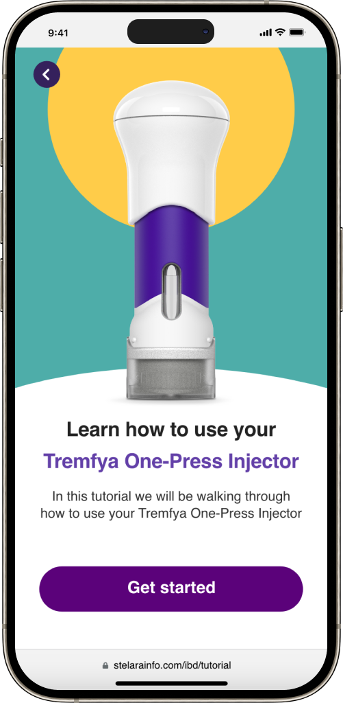

Tremfya is a prescription medicine used to treat adults with moderate to severe plaque psoriasis who may benefit from taking injections
The problem: Tremfya has launched an exciting new product and wants to help both new and current customers learn how to use it safely. The old training guide was just a PDF, but it wasn’t clear enough, leaving users confused about how to use the product. Now, the challenge was to create something much better and something that really work with all users.
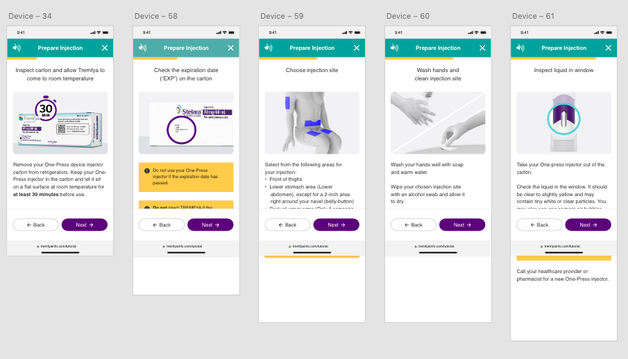
My Role: As a UX/UI Designer at Johnson & Johnson, I had the exciting challenge of developing three unique tutorials for Tremfya One-Press. I created a Digital Trainer, an Interactive Digital Trainer, and a Video Trainer, giving users three engaging ways to learn how to use the product with confidence and clarity. Each option was designed to meet different learning styles, ensuring everyone could understand the product easily.
User Testing: Our test subjects, ranging from ages 21 to 55, went through three rounds of user testing, and the feedback we received was invaluable. Each round gave us deep insights that shaped every design decision, making the process both challenging and rewarding. In the end, their input helped us create three incredible tutorials that truly resonate with users and ensure a clear understanding of the product.




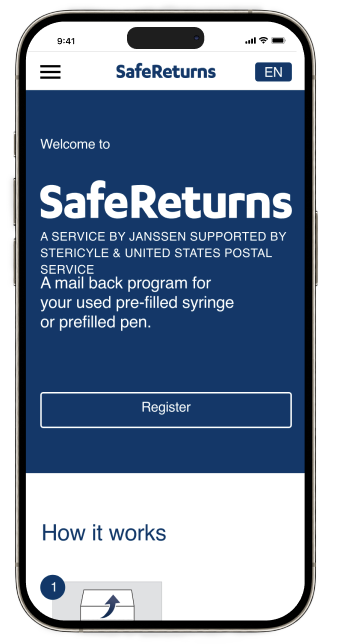
Safe Returns is a simple, safe, and convenient way to dispose of your used devices at no cost to you. After registering, you will receive a certified Safe Returns mail-back envelope in the mail, along with easy-to-follow mail-back instructions.
The Why: Recycling used syringes is crucial for both public health and environmental sustainability. Proper disposal prevents the spread of infectious diseases, protects waste workers from accidental needle injuries, and reduces the risk of environmental contamination. By recycling syringes, we can recover valuable materials and reduce the need for new resources, ultimately decreasing pollution and conserving energy. In turn, this helps reduce the global waste footprint and contributes to a healthier, more sustainable planet.
My Role as a UX/UI Designer at Johnson & Johnson, I was tasked with transforming the user experience into something modern, intuitive, and impactful. I added four important features: text updates to track shipments, an easy way to reorder return kits and manage accounts through the user portal, eco-friendly information through emails and the portal, and a cash reward system. These changes made the platform more user-friendly, while also encouraging people to think about the environment and stay engaged.
To showcase my design processes I have 4 scenarios below with simple wireframes and some case study info which help me design each product.
Design inspiration: Amazon Push notifications and delivery text was the inspiration behind this design.
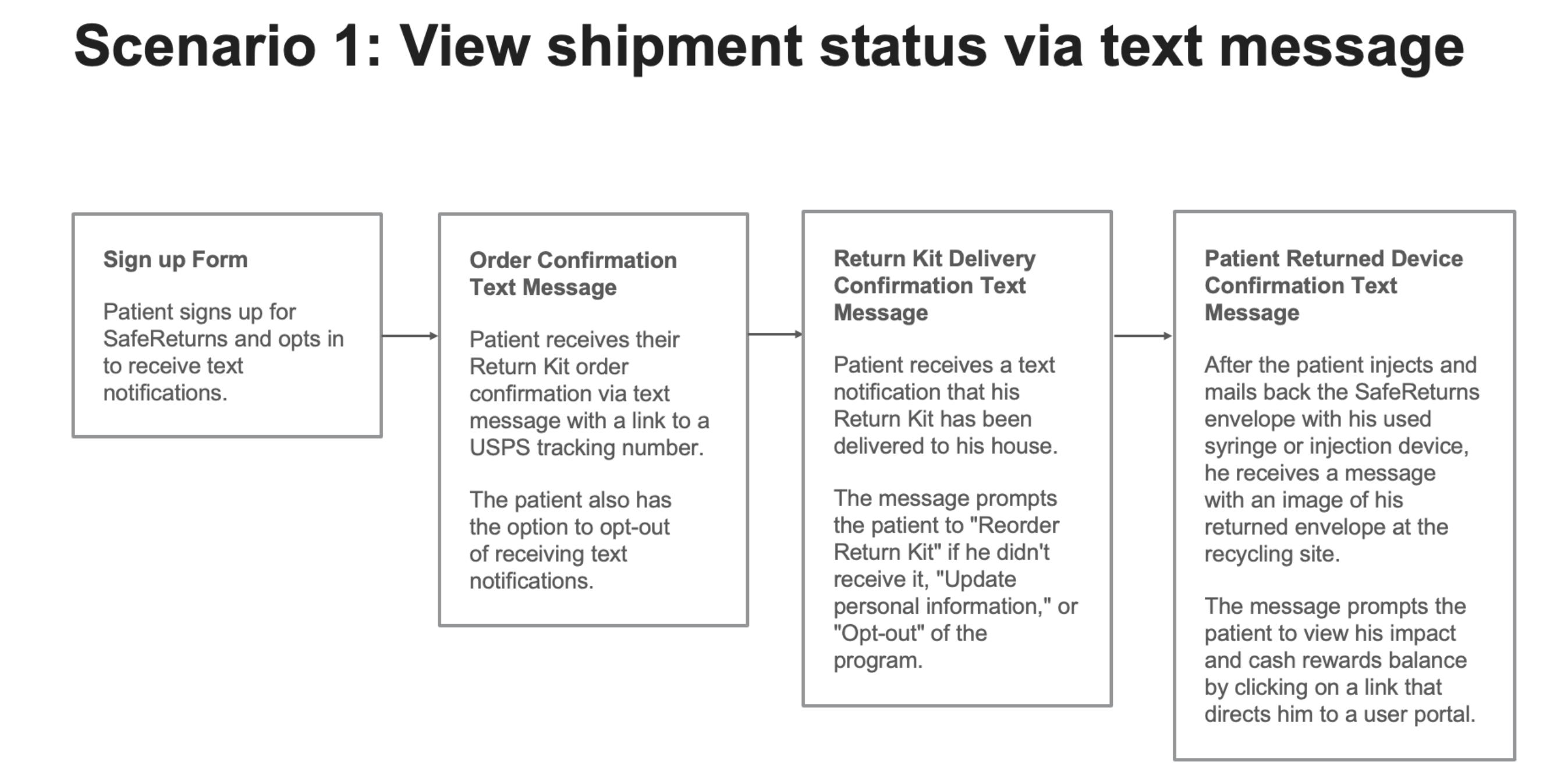
Design inspiration: Domino’s pizza app deliver status. Uber pick up status.

Design inspiration: Terracycle recycling program, best buy mail in recycling program.

Design inspiration: Apple watch excises reward system, Upside cash out system.

UI Design
Once I workout the users journeys, I developed the screens in Adobe XD
. Safe Return, the visual style I followed clean, minimalist, and user-centered, I focusing on simplicity, and accessibility. With a modern aesthetic, professional typography, and subtle use of their signature blue, my designs prioritize clear navigation, with a touch of gamification.
. The inspiration behind this design was to make an easy, fun, engaging application.
. What gives me the most pride about this design is how I was able to add gamification into the design because it was a hard sell within the Johnson & Johnson chain of command.
. The Design was built to be viewed on all mobile devices with a global role out in mind.
User Testing
Before launching the product, I did testing rounds in order to reveal possible usability problems.
What the user testing consisted of
. My test subjects were Man and Women ages 35 to 65
. Verify the accuracy of navigating through the design.
. Verify if users like or disliked, the reward system
. Verify if users like or disliked, the gamification of receiving a badges for there recycle use.
. Verify if users like or disliked, receiving a cash rewards for there recycle efforts.
. Verify if users like or disliked, the ability to see shipping status.
. Verify if users like or disliked the user portal
. Verify if users like or disliked the ability to manage notifications
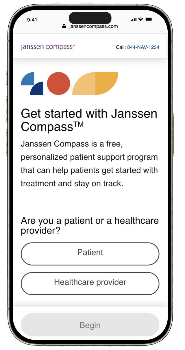
Janssen Compass is a free, personalized patient support program that can help patients get started with treatment and stay on track.
The goal: Create a sign up experience for patient’s and healthcare providers thats easy and straight forward and engaging
My Role: As UX/UI Designer at Johnson & Johnson, I was tasked with transforming the user experience into something modern, intuitive, and impactful.
Here's a glimpse of how my designs evolve from simple wireframes and sketches into high-level, polished prototypes. It’s an exciting but challenging process, where each step brings new opportunities to refine the experience and solve real user problems. Watching these early concepts transform into fully interactive prototypes is one of the most rewarding parts of the design journey!
View Prototype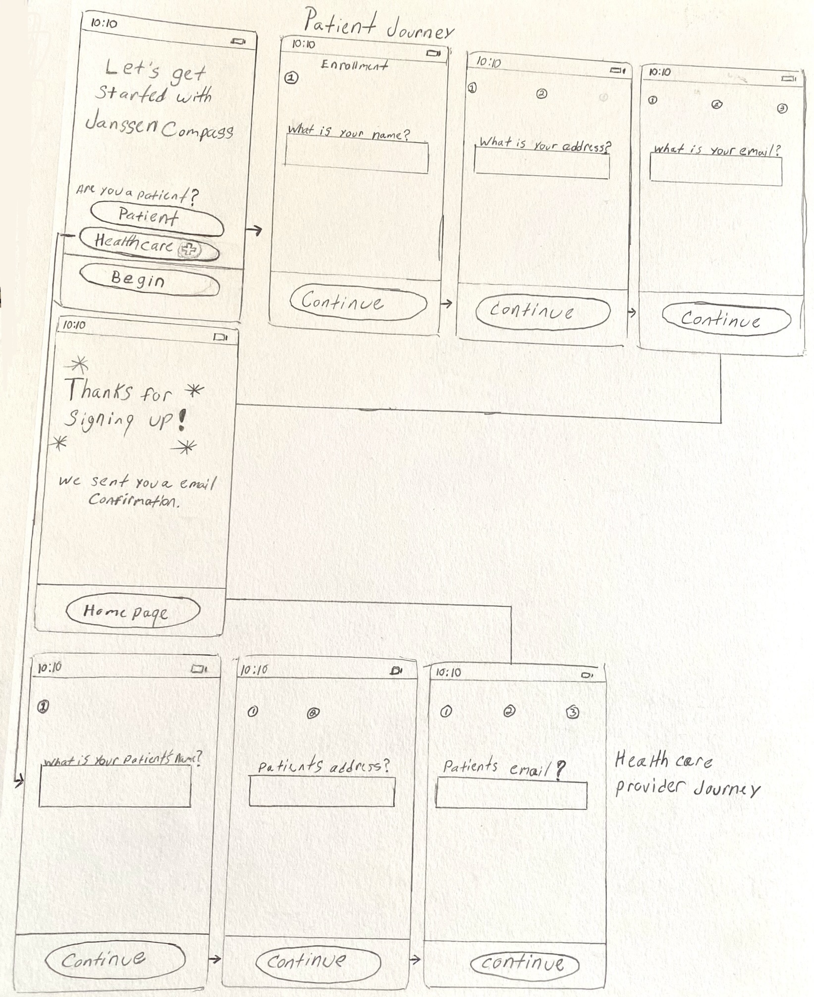

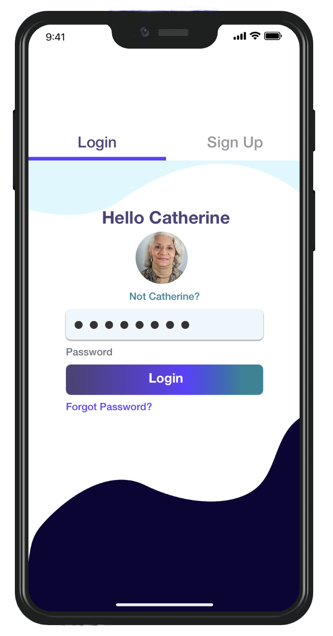
Total Health Hub is an application that provides peace of mind to caregivers, patients, and healthcare providers via access to appointments, medical records, plans of action, and drug prescriptions in patient-friendly terms via a secure repository.
The Problem Caregivers of chronically ill, elderly patients often feel lost in the medical jargon of prescriptions, records, and visits without an interconnectedness of healthcare providers.
My role as Director of Design was to build a functional prototype to showcase to potential investors.
The team I work with consisted of Michael Ofuasia UX Designer, Tolu Ajayi UX Designer, Erin Greene Design Thinking Coach, Danielle Mitchell Agile Marketing, Shayna Atkins Agile Coach
To understand how customers find and interact with the service we created a Customer and Doctor Journey Map.
View Prototype

UI Design
Once I tested out all usability mistakes, I started designing the final screens in Sketch.
. Total health hub, the visual style I followed was Fresh, Fun, corporate, dark highlights, light background.
. The inspiration behind this design was to make an easy, fun, engaging application.
. The entire architecture is designed with HIPPAA compliance from the ground up.
. We will follow Amazon's official white paper on HIPPAA-compliant application development.
. The Apple iOS platform was the target that I design for.
. What gives me the most pride about this design is how we were able to condense
a lot of technical information and make it easy to use and navigate.
User Testing
Before launching the product, I did testing rounds in order to reveal possible usability problems.
What the user testing consisted of
.Browse upcoming appointments
.Verify the accuracy of notes from the visit
.Share current health information with caregivers and loved ones
.Confirm names, dosages, instructions, and side effects of current medications
.My test subjects were doctors and patients Man and Women ages 38 - 65.
User adoption rate Projection
Base off of data from similar applications
Year 1 Users 100,000
Year 2 Users 225,000
Year 3 Users 1,125,000
Year 4 Users 2,250,000
Financial Projection
According to our conservative financial projection, our revenue, as well as net profit,
will steadily increase over the next 5 years. Expect to hit over $65M in revenue 5 years.
Year 2 $9M
Year 3 $20M
Year 4 $45M
Year 5 $65M

Dr. Sanlare Gordon
ATKCO